
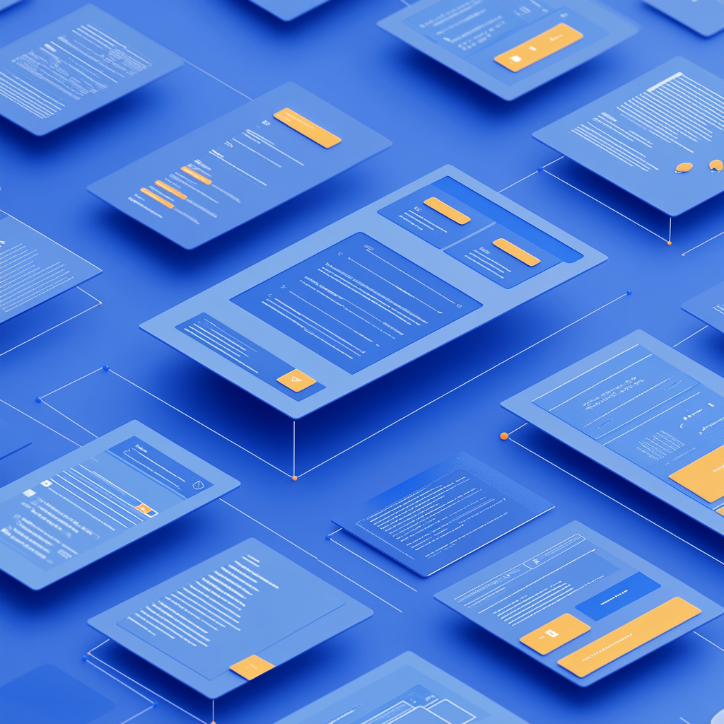
The Role of Structure in UI Design
Structure in UI design is the invisible skeleton that holds everything together. It’s not just about alignment or layout—it’s about how information is presented, how users interact with it, and how the experience flows from one step to another. When structure is thoughtfully applied, it brings order to complexity and clarity to chaos. Interfaces that follow a strong structure guide the user naturally, helping them process information quickly and act with confidence. It defines the relationship between elements, prioritizes what’s most important, and sets expectations that reduce the need for guesswork.
A well-structured UI supports both aesthetics and function. For instance, using consistent spacing rules, clearly defined headers, and visual hierarchy helps users understand where they are and what they can do. It also makes design decisions more objective—no longer based on personal taste, but on consistent logic and usability principles. Furthermore, structure aids collaboration: designers, developers, and stakeholders speak a common language when referring to layout systems or component behavior. Without structure, even the most beautiful interface risks becoming frustrating or confusing. With it, users move smoothly through your product, feeling supported rather than lost.
Understanding and Applying Grids
Grids are one of the most powerful tools in a UI designer’s arsenal. They transform blank canvases into structured, legible, and flexible designs. A grid system divides space into columns, rows, and gutters that guide the placement of content. This framework allows designers to create alignment, rhythm, and balance across interfaces, regardless of the screen size. When applied consistently, grids not only create visual harmony but also enhance the accessibility and clarity of the design by ensuring that elements are predictable and aligned.
Beyond aesthetic benefits, grids streamline collaboration and scalability. Developers rely on defined grids to ensure code matches design, while design teams can maintain consistency across multiple products or pages. Grids also simplify responsive design: by using breakpoints and flexible column widths, layouts can adapt gracefully across devices without losing their structure. Whether you’re designing a simple landing page or a complex enterprise dashboard, starting with a grid reduces trial-and-error and encourages intentional design choices. Grids make the invisible structure visible and give designers a sense of control over both space and flow.
Modularity as a Design Principle
Modularity changes how we approach UI design by shifting the focus from isolated pages to reusable building blocks. Instead of creating every interface from scratch, modularity encourages the use of repeatable components that can be assembled and reassembled in different contexts. These modules—like buttons, cards, dropdowns, and alerts—follow consistent styles and behaviors, reducing the chance of visual inconsistency. As a result, designers save time, developers write cleaner code, and users benefit from familiar, predictable interactions.
In a modular system, each component becomes a part of a larger design ecosystem. This enables faster prototyping and iteration because you’re never starting from zero. Modularity also improves collaboration: teams can create, document, and update components centrally, so improvements ripple across the entire product. Design systems thrive on this principle, offering scalable libraries of pre-built, accessible UI parts. Additionally, modular thinking fosters better decision-making—by considering how a component fits into multiple contexts, designers become more thoughtful about layout, interaction states, and edge cases. In essence, modularity fosters efficiency without sacrificing quality.
Creating Visual Consistency Across Components
Visual consistency is what makes a UI feel polished, reliable, and easy to use. It’s the repetition of familiar patterns that helps users feel comfortable navigating a product. When components look and behave consistently—whether it’s a call-to-action button, a form field, or an error message—users don’t need to relearn how things work. This familiarity speeds up interaction and builds trust. Consistency also supports branding, as repeated use of color, typography, and spacing reinforces identity and creates emotional cohesion.
Achieving consistency requires discipline and systems thinking. A robust design system or style guide is essential: it defines rules for spacing, font sizes, icon usage, color palettes, and more. But consistency isn’t about making everything identical—it’s about making everything feel like it belongs to the same family. For example, alerts might vary in color and size depending on severity, but they should still follow the same layout and animation logic. Consistency extends to interaction feedback, loading states, and even microcopy. When done well, it fades into the background, allowing users to focus on their tasks instead of decoding the interface.
Scaling Design Systems with Modular Thinking
Scaling a design system is one of the biggest challenges faced by growing digital products, especially those with multiple teams or platforms. As the product evolves, so does the complexity of its UI, and without a plan, things can quickly spiral into inconsistency and clutter. Modular thinking provides the key to scaling efficiently. By focusing on reusable components and patterns, teams can create systems that are adaptable, cohesive, and future-proof. It’s not just about building components—it’s about building them in a way that anticipates change.
Modular thinking means designing components that are flexible and self-contained, yet also capable of working together seamlessly. For example, a modal window should work no matter what kind of content it holds, and a button should adapt to various states and themes without needing custom styling. This approach enables distributed teams to collaborate without duplicating work or deviating from the standard. Documentation, version control, and shared libraries are essential tools in this process. As design systems grow, modularity ensures they don’t collapse under their own weight. Instead, they evolve organically, supported by a mindset of reusability, scalability, and design integrity.
Common Pitfalls and How to Avoid Design Chaos
Even experienced teams can fall into chaos if core design principles are ignored. Avoiding disorganization requires attention to detail and commitment to foundational practices. Here are five common pitfalls that disrupt good UI design—and how to steer clear of them:
- Lack of structure – Without a consistent layout, users can’t understand hierarchy or flow. Start every design with a clear grid and visual alignment strategy to avoid visual confusion.
- Inconsistent components – Deviating from established component styles causes user confusion and design debt. Use a shared design system to maintain uniformity and avoid reinventing elements.
- Poor scalability – Designing custom solutions for every new feature slows progress. Focus on modular components that adapt to different contexts, making the system easier to expand.
- Visual overload – Too many styles, fonts, or effects weaken readability and hierarchy. Keep your visual language minimal, using design tokens and rules to create clarity instead of noise.
- Ignoring user flow – A beautiful interface is meaningless if it doesn’t support real tasks. Always prioritize user journeys, testing flows to ensure functionality, clarity, and intent.
By being mindful of these pitfalls, designers can stay focused on creating clean, intuitive, and consistent interfaces. It’s not about perfection—it’s about intention and discipline. The best UI designs are those that feel effortless to use, even though they’re built on deeply thoughtful foundations.
Question and Answer
Answer 1: It brings clarity, guides user flow, and reduces confusion through a logical and consistent layout.
Answer 2: They help maintain alignment, balance, and responsiveness across all screen sizes and content types.
Answer 3: It speeds up development, ensures consistency, and allows easy updates across the entire product.
Answer 4: It builds user trust, improves usability, and reinforces brand identity through predictable patterns.
Answer 5: Lack of structure, inconsistent components, poor scalability, visual overload, and ignoring user flow.