
A fine perfume doesn’t just hit you all at once — it opens in layers. There’s a bright top note, a warm heart, a deep base that lingers. Good digital experiences are like that too. They’re built from small interactions and subtle transitions that unfold in the right order, never all at once.
When you think about your UX like a fragrance composition, you begin to see how each element must balance the others. It’s not about piling on features — it’s about knowing what to reveal, when to hold back, and how to leave your user with a clear impression that feels intentional.
Why layers matter more than single screens
Too many teams design each screen in isolation. But real user journeys flow. A well-layered interface is like a perfume that lasts: each step supports the one before and hints at what’s next. UX layering gives your design a rhythm.
When you create digital ‘notes’, you think about:
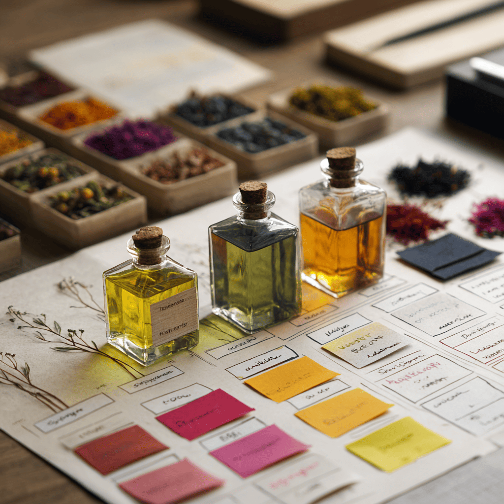
- What’s the top note? The first impression: colors, hero image, catchy line.
- What’s the heart note? The main interaction: forms, sliders, content modules.
- What’s the base note? The lasting impact: microcopy, animations, tiny details that stick.
Users rarely say, “I love the layers!” but they feel when it’s missing. Just like a flat perfume feels cheap, a flat UX feels rushed and forgettable.
Using contrast to separate top, heart, and base layers
Perfumers use contrast — citrus with woods, sweet with smoky — to build interest. Great interfaces do the same with visual hierarchy.
Your top note should grab attention without shouting. Bold headings, vibrant color blocks, or hero illustrations can do that. But you don’t want it so loud that it drowns out the heart.
Heart layers should feel supportive, not cluttered. Smart spacing, modular grids, and consistent icons help. They hold the structure together.
Your base note in UX is all the tiny touches: hover states, helpful tooltips, feedback animations. Subtle but important, like a drydown that stays on the skin for hours.
Why tension and release create emotional flow
A master perfumer plays with tension: a sharp opening, then a mellow drydown. In UX, the same idea keeps users engaged. You can’t deliver everything at once — you need breathing room.
Think about onboarding flows. Instead of dumping all instructions up front, reveal steps gradually. Let the user feel progression, not overwhelm. Small moments of microinteraction — a success checkmark, a playful animation — feel like a whiff of something special before the next layer arrives.
Good layering avoids fatigue. It moves the user through complexity without making them feel lost.
Building a design system that supports scent-like layers
It’s tempting to craft beautiful layers for a hero page and forget the rest. But sustainable UX layering needs a system. If a perfumer didn’t use the same base notes every time, their fragrances wouldn’t feel cohesive. Same with your product.
A smart design system includes:
- Rules for headings, body text, captions — each playing its part.
- Motion guidelines: when to use fade, slide, or bounce.
- Reusable interaction patterns so each page feels related.
When your system works, every new feature smells like it belongs.
Real examples: microcopy as your base note
People think about colors and buttons first. But small words — your microcopy — are the invisible base note that makes the whole thing stick.
Imagine a checkout: your bright top note is the product shot, the heart is the payment form, and the base is the tiny reassuring line under the button: “Safe & secure checkout.” This one line can feel like a whisper of trust — just like a perfume’s last note reminds you it’s still there.
If you rush this, you break the balance. That’s why teams who treat copy as part of UX layers get better user trust.
Knowing when to stop adding new ‘notes’
A common trap is over-layering. In perfumery, too many notes make a scent muddy. In UX, too many hover states, animations, or shadows make your interface look dated.
Restraint is what makes an experience feel timeless. It’s not about minimalism for minimalism’s sake. It’s about letting each layer breathe. Give the top note space to catch attention, the heart note room to guide action, and the base note the calm to stay memorable.
Before wrapping up, explore how typography can carry these emotional ‘notes’ too — head to our article Frontend typography and olfactory moods: pairing fonts with perfume moodboards to learn how fonts can echo scent-like feelings in your design language.
A good perfume is never just ingredients — it’s how they interact over time. Your UX is no different. Craft your top, heart, and base layers with intention, balance them like a fragrance, and your users will sense the care, even if they can’t name it.
Digital products that feel effortless are never accidental. They’re designed like a good scent: clear, layered, and ready to linger.
Questions and answers
Throwing everything at once instead of pacing information and interactions in steps.
Use a strong design system with shared rules for spacing, typography, and microinteractions.
Absolutely — too many animations, gradients, or steps can confuse the user. Keep it clear and intentional.