
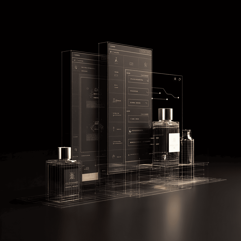
A minimal wireframe can feel cold and empty — or it can radiate a subtle sense of luxury, just like a fine fragrance that doesn’t overwhelm but leaves a trail. Many designers chase minimalism because it’s modern and clean. But not every minimal layout feels premium. The secret is in the invisible layers: microdetails, thoughtful whitespace, and emotional cues that make a user feel they’re experiencing something special.
Think of it like scent branding. A good perfume doesn’t shout. It whispers, unfolds, and lingers. Your minimalist design can do the same when you add just enough warmth and personality, balanced with restraint. That’s how a simple wireframe transforms from plain to quietly expensive.
The silent power of negative space
Whitespace isn’t emptiness. It’s the canvas that makes your content breathe. In luxury fragrance design, the packaging often feels generous — wide borders, soft curves, unhurried typography. Your wireframe should echo this.
When you build a minimal layout, ask:
- Does each element have room to stand alone?
- Is there a clear visual hierarchy that guides the eye naturally?
- Do your spacing ratios stay consistent across breakpoints?
Small tweaks — like expanding the padding around a hero heading or giving a call-to-action more margin — can make the whole page feel calm and intentional, not barren.
Subtle typography: your invisible signature
Fonts are like fragrance notes. A single misstep can break the mood. In minimalist layouts, typography becomes your strongest branding signal. It carries the emotion that visuals intentionally hold back.
A clean sans-serif feels modern and crisp, but pair it with generous letter spacing or a softer weight, and it becomes sophisticated rather than sterile. High-contrast serifs add a sense of tradition, while rounded forms feel warm and inviting.
One overlooked trick: tie your line heights and letter spacing to the ‘scent’ of your brand. If your fragrance branding is airy and fresh, open up the type. If it’s deep and sensual, tighten it just a bit to add density.
Color accents: the top notes of your interface
A luxurious scent has bright top notes that grab attention, then fade into deeper layers. A minimal design can do the same with color. Even in an almost monochrome wireframe, a single accent — a muted gold underline, a warm taupe hover state — hints at richness.
Avoid neon or trendy colors that clash with an elegant vibe. Instead, build a restrained palette that looks timeless. Think of it like a fragrance bottle’s tiny ribbon or foil stamp — one small detail that elevates the whole experience.
Keep your accent colors consistent across your design system. They become part of your digital brand scent.
Microinteractions: when motion feels like diffusion
Scent drifts — it’s never static. Microinteractions in your minimal layout act like this gentle diffusion. A soft fade, a slight slide, or a hover effect that feels almost imperceptible can turn a static block into something alive.
But don’t overload your wireframe with too many effects. The best motion in a luxurious minimal design is barely there. It guides, reassures, and disappears.
Two practical microinteraction ideas:
- Use subtle opacity shifts rather than harsh bounces.
- Stagger elements so they appear like a trail, not a sudden burst.
Texture and depth without clutter
Perfume branding often uses tactile textures — embossed paper, frosted glass. Digital design can’t recreate touch, but it can suggest depth. Think delicate shadows, layers that hint at dimension, gradients so soft they’re barely visible.
In a wireframe, depth should feel balanced. Drop shadows shouldn’t look like heavy boxes. Rounded corners can soften harsh edges but should be used sparingly. Like scent layers, it’s about balance.
Check your design on different screens: depth can get lost or look muddy on low-quality displays.
Consistency: the final note that makes it feel real
Your layout might be minimalist, but if its elements don’t feel consistent, you lose the illusion of luxury. Mismatched buttons, awkward paddings, or conflicting hover states break the spell.
A strong system of spacing, typography, color, and motion is your ‘scent formula’. It ensures that every page, no matter how stripped-back, still feels cohesive and premium.
Run a quick audit: Does each screen feel like it belongs in the same family? Does the brand’s sensory mood come through at every breakpoint?
Before you wrap up, see how microcopy can extend this brand scent. Jump over to The god of fire perfume and branded microcopy: when scent becomes a digital signature for ideas on writing that feels like part of your luxurious vibe.
When you treat your minimalist wireframe like a fine fragrance, you move beyond sterile grids. You craft an experience that feels intentional, calming, and subtly opulent.
Negative space, typography, accents, microinteractions, and consistency — each detail builds your invisible scent trail. Users won’t always know why they trust your brand, but they’ll feel it.
Questions and answers
They lack microdetails — generous spacing, thoughtful typography, and subtle accents that add emotional depth.
Use consistent spacing, a timeless color accent, and microinteractions that feel intentional and calm.
Both rely on subtle layers that evoke emotion — your layout can echo this with visual and motion cues.