
The way a typeface feels on screen is more than just readability — it’s an emotional echo. Think of how a perfume sets a mood through its notes. Your typography can do the same, layering subtle cues that shift how users sense your interface. A font can whisper fresh and airy, or murmur deep and smoky, just like a scent that lingers in the air.
For designers who build moodboards, the connection between fragrance and typography can be powerful. Both balance logic and feeling. They rely on restraint, craft, and the courage to leave space. The result? An experience that feels intentional — and just like the perfect perfume, one your audience wants to return to.
Why typefaces feel like scents: the psychology of visual aroma
When you first see a heading on a landing page, you’re not reading — you’re feeling. Sharp serifs, soft rounded edges, tight kerning — these details imprint a tone before the words even sink in. Fonts are the olfactory layer of digital design: invisible, yet unmistakably there.
Perfumers know that balance matters. Too sweet becomes cloying, too smoky can feel harsh. The same applies to type. An overly decorative script can overpower an interface; a stark sans-serif may feel sterile without context.
Strong typography for a digital product feels:
- Distinct enough to carry brand personality.
- Flexible enough to stay legible across breakpoints.
A good test is to read your copy aloud and see if the font’s ‘voice’ matches. If you’re designing for a scent-inspired brand, your type choice should echo that same atmosphere.
Pairing fonts with fragrance moods: practical approaches
So how do you translate a perfume’s mood into typographic choices? Start with the notes: Is it fresh? Spicy? Smoky? Each has a visual counterpart.
For a clean, zesty scent, think lightweight sans-serifs with generous spacing. They evoke air and clarity. For a deeper, woody note, you might explore classic serifs with subtle curves that hint at tradition and warmth.
When building your moodboard:
- Combine fragrance imagery with font samples.
- Test pairings side by side, like a perfumer testing blend combinations.
This method helps clients or teams ‘feel’ the vibe instantly — they can smell it with their eyes.
How microtypography layers echo scent complexity
Perfumery is all about layers: top, heart, base. Typography has layers too — headlines, body text, captions, microcopy. Each plays a role in the final experience.
Well-crafted microtypography:
- Guides the reader effortlessly.
- Adds subtle hierarchy.
- Keeps the mood consistent.
Small things like line height, letter spacing, and alignment act like the base notes that give your brand depth. They’re easy to overlook but can make or break the feeling.
Imagine a luxurious perfume ad with cramped lines or awkward breaks — the message would clash with the vibe. The same goes for your product UI.
Consistency as a signature: keeping the aroma intact
A perfume loses its magic if its notes clash or fade unevenly. Your typography should be just as stable. If your landing page uses elegant serifs but your product screens default to a generic sans, the mood evaporates.
Design teams should document type choices in a style guide that feels like a perfumer’s formula. It should include:
- Primary and secondary fonts.
- Rules for weights and sizes.
- How type interacts with colors and imagery.
This ensures that no matter who touches the design, the ‘scent’ stays familiar.
When whitespace acts like perfume’s sillage
A fine fragrance leaves a trail — sillage — that people notice even when you’re gone. Good typography does this too. The spaces between letters, lines, and blocks let your message breathe.
Cramped layouts are the olfactory equivalent of cheap cologne: overpowering and short-lived. Generous, intentional whitespace feels refined. It lets your chosen font shine and reinforces the brand mood.
Practical tip: test your typography with real content and realistic line lengths. What looks beautiful in Figma might feel dense on mobile.
Evolving your type ‘scent’ as your product grows
Just as a fragrance line releases new editions, your brand typography may evolve. Seasonal campaigns, new audiences, or platform changes might require tweaks.
Treat your typography as an evolving blend:
- Add new styles carefully, like a new note.
- Test for consistency across devices.
- Listen to user feedback — does the new vibe feel authentic?
Before you finalize, remember how motion can enhance these moods. Explore our piece Scents in motion: animation inspired by scent diffusion to see how movement brings your olfactory moodboard to life on screen.
When your fonts and fragrance moodboards align, your digital product feels like more than pixels — it feels alive. Typography, like perfume, works through memory and emotion. Choose your notes wisely, layer them with care, and let your design leave a subtle trace that people remember.
Questions and answers
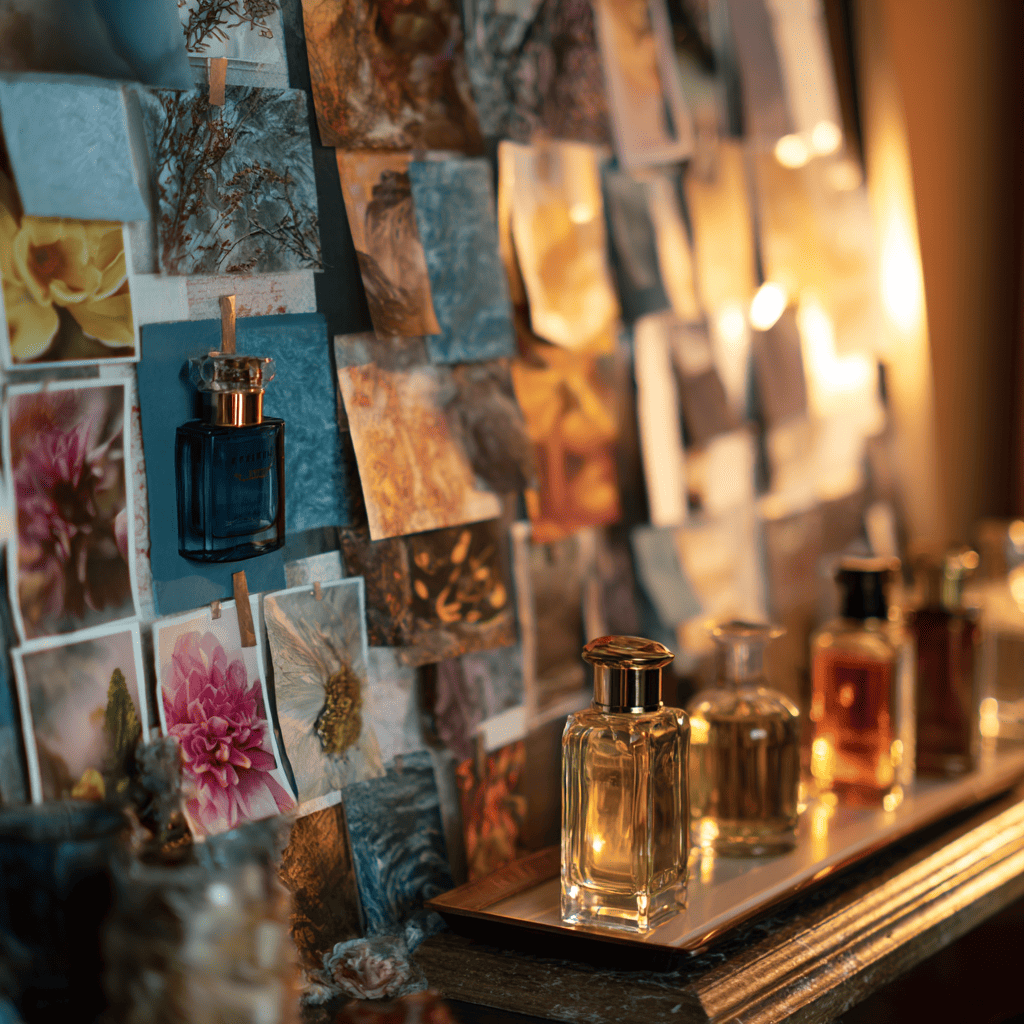
Show a side-by-side moodboard with perfume visuals and typography samples — it makes the emotional link clear.
Not always, but for lifestyle, luxury, or creative brands, it adds depth and emotional resonance.
Overcomplicating it. Stick to a few clear styles and use spacing to keep the ‘scent’ clean and balanced.